Introduction
Ever looked at an immune system cells flow chart and felt your eyes glaze over? Yeah, you’re not alone. The immune system is incredibly complex, but here’s the thing you don’t need a medical degree to understand how it works. Your body’s immune system is basically a sophisticated security team, and understanding how immune cells communicate, attack threats, and protect you can genuinely change how you think about your health.
The problem? Most immune system cells flow charts online are either too technical or way too simplified. They skip over the really important stuff like how different immune cells actually coordinate their defense strategies, or why some people’s immune systems are stronger than others. That’s exactly why we created this guide.
In this article, you’ll learn the complete picture of how immune cells function as an integrated system, how to interpret immune system cells flow charts like a pro, and most importantly, what you can actually do to support your immune system based on this knowledge. By the end, you’ll understand not just what immune cells are, but how they work together and you’ll have concrete strategies to strengthen your immunity.
What Exactly Is an Immune System Cells Flow Chart?
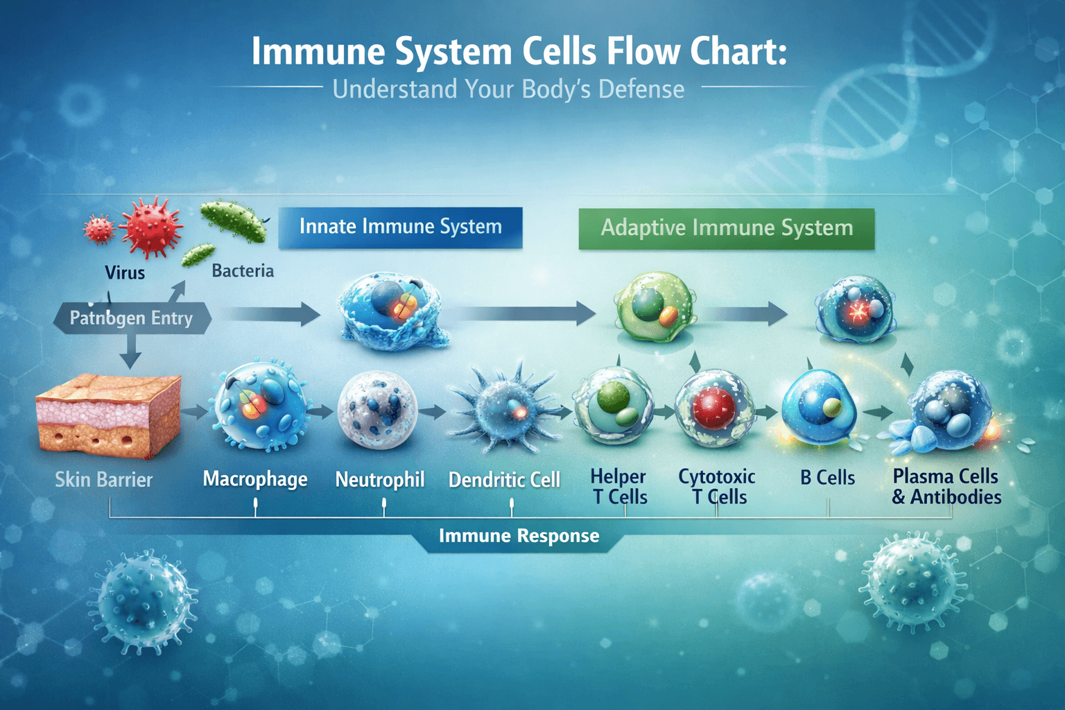
Let’s start with the basics. An immune system cells flow chart is essentially a visual roadmap showing how your body detects threats (bacteria, viruses, cancer cells) and responds to eliminate them. Think of it like a flowchart you’d see in a business process, but instead of money flowing through a company, it’s showing how immune information flows and how different cells respond.
The beauty of understanding an immune system cells flow chart is that it reveals something most people don’t realize: your immune system isn’t just one thing. It’s more like multiple specialized teams that need to communicate perfectly with each other. When that communication breaks down, you get sick. When it works smoothly? You stay healthy.
Why Visual Learning Matters
Most of us process information better when we can see it. An immune system cells flow chart transforms abstract biological concepts into something concrete. Rather than reading “T cells activate B cells which produce antibodies,” you can actually trace the pathway from pathogen detection to immune response. That visual representation sticks with you.
The Main Players: Understanding Key Immune Cells in the Flow Chart
White Blood Cells: The Core of Your Immune Defense
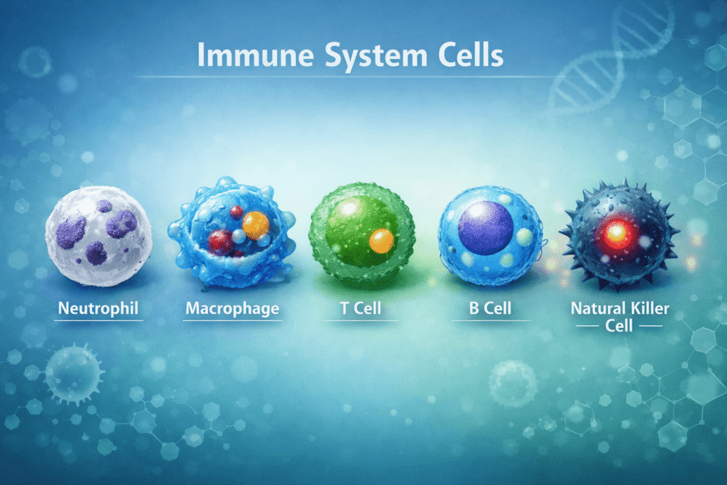
Your white blood cells are the soldiers in your immune army. There are several major types, and each has its own role. When you look at an immune system cells flow chart, white blood cells usually sit at the center because they’re the active responders.
Neutrophils are your frontline fighters they arrive first to any infection and form the bulk of your white blood cell count. On an immune system cells flow chart, you’ll often see neutrophils positioned early in the response pathway because they literally rush toward danger.
Macrophages are the cleanup crew. These cells engulf pathogens, dead cells, and debris. On most immune system cells flow chart diagrams, macrophages appear both early (for initial threat response) and later (for cleanup). They also send chemical signals to recruit reinforcements.
Lymphocytes are the strategic planners. These include T cells and B cells, which we’ll dive deeper into. When tracing an immune system cells flow chart, lymphocytes usually appear further along because they coordinate more complex, targeted responses.
The T Cell and B Cell Partnership
This is where an immune system cells flow chart really shows its value. T cells and B cells don’t work alone they work together.
Helper T cells (also called T4 cells) are the coordinators. They recognize when a threat is present and send out chemical signals telling other cells what to do. On your immune system cells flow chart, helper T cells usually sit at a central hub with arrows pointing to multiple cell types.
Killer T cells (T8 cells) are the assassins. Once activated, they seek out and destroy infected cells. In an immune system cells flow chart, you’ll see killer T cells linked to infected cell destruction.
B cells are the weapons manufacturers. When activated, they transform into plasma cells that churn out antibodies specific proteins designed to target specific pathogens. Any decent immune system cells flow chart shows B cells connecting to antibody production.
The relationship between these cells is crucial. Without proper signaling from helper T cells, B cells won’t produce enough antibodies. This is why understanding the pathways on an immune system cells flow chart matters it shows why everything has to work together.
Natural Killer Cells: The Quality Control Team
Natural killer cells (NK cells) roam your body looking for cells that aren’t behaving normally. They’re especially good at catching cancer cells or virus-infected cells that might try to hide. On a comprehensive immune system cells flow chart, NK cells usually appear as an independent but interconnected pathway.
Tracing the Immune Response: How to Read an Immune System Cells Flow Chart
Understanding an immune system cells flow chart means learning to trace the sequence of immune response. Here’s how it typically flows:
Step 1: Threat Detection
Everything starts with recognition. Immune system cells have receptors that can identify pathogens—bacteria, viruses, or abnormal cells. In your immune system cells flow chart, this is usually shown as the first box or starting point.
Dendritic cells are crucial here. They’re like scouts who capture fragments of invaders and then run back to immune headquarters (your lymph nodes) with intel. Most detailed immune system cells flow chart diagrams highlight dendritic cells in this role.
Step 2: Activation and Signaling
Once a threat is identified, immune cells need to communicate. This involves chemical messengers called cytokines. When you look at an immune system cells flow chart, cytokines are often shown as arrows or connecting lines between cells.
Helper T cells get activated when they receive the right signal. They then produce cytokines that activate B cells and killer T cells. This is the critical orchestration moment—without it, your immune response is weak and uncoordinated.
Step 3: Targeted Response
Now cells mobilize. Antibodies are produced (B cells). Infected cells are destroyed (killer T cells). Pathogens are engulfed and neutralized (macrophages and neutrophils). A good immune system cells flow chart shows these parallel actions happening simultaneously, not sequentially.
Step 4: Resolution and Memory
After the threat is eliminated, most immune cells quiet down. But some B and T cells transform into memory cells that “remember” this specific pathogen. If you encounter it again, your immune system responds faster and stronger. This is exactly why vaccines work they train your memory cells without requiring a real infection.
On an advanced immune system cells flow chart, memory formation is shown as a feedback loop, which accurately represents how immunity becomes more resilient over time.
Supporting Your Immune System: Practical Applications Beyond the Flow Chart
Understanding an immune system cells flow chart is educational, but the real value comes from using this knowledge to strengthen your immunity. Here’s how:
Nutrition That Powers Immune Cells
Your immune cells need fuel. Vitamin D regulates T cell development. Zinc enables neutrophil and NK cell function. Vitamin C supports multiple immune pathways. When you understand an immune system cells flow chart, you realize that nutrition isn’t just about “staying healthy”—it’s about giving your immune cells the specific nutrients they need to perform their roles.
A Mediterranean diet rich in antioxidants, lean proteins, and healthy fats supports every cell type shown in an immune system cells flow chart.
Sleep Enables Immune Coordination
During sleep, your body produces cytokines—those chemical messengers we talked about in the flow chart. Without adequate sleep, these coordinating signals aren’t sent effectively. Your immune system cells flow chart only functions well when cells can communicate, and communication requires adequate rest.
Stress Management Affects the Whole System
Chronic stress suppresses helper T cells and increases inflammatory responses. If you map stress’s effects onto an immune system cells flow chart, you see immediate disruption of the carefully balanced system. Meditation, exercise, and other stress-reduction practices help maintain the elegant coordination shown in a proper flow chart.

Top Immune System Supplements & Learning Tools
Based on what we know about how immune cells function (as shown in an immune system cells flow chart), these products can help support your immunity:
1. Elderberry Immune Support Complex
[Placeholder: elderberry supplement ]
Why it works: Elderberry has compounds that help activate macrophages and boost T cell response both crucial nodes in your immune system cells flow chart. This supplement specifically targets the antibody production phase.
2. Advanced Immunology Course (Online Platform)
[Placeholder: online course ]
If you want to go deeper into understanding immune system cells flow chart concepts at a sophisticated level, structured learning beats random YouTube videos. This course walks through actual research-level immune cell interactions.
3. Vitamin D3 + K2 Formula
[Placeholder: supplement ]
Vitamin D regulates the very T cell activation shown in your immune system cells flow chart. This formula combines the two vitamins your immune system relies on most.
4. Gut Microbiome Probiotic Blend
[Placeholder: probiotic ]
70% of immune cells live in your gut. This probiotic supports the microbiome that educates and trains those cells essentially helping the communication shown in your immune system cells flow chart happen at the intestinal level.
Comparison Table: Immune Support Products
| Product | Primary Benefit | Cost (Est.) | Best For |
|---|---|---|---|
| Elderberry Complex | T cell activation | $15-25 | Viral prevention |
| Vitamin D3+K2 | T cell regulation | $12-20 | Daily support |
| Probiotic Blend | Gut immunity | $20-30 | Digestive health |
| Immunology Course | Knowledge building | $99-199 | Deep learning |
| Immune Booster App | Tracking/Education | Free-$9.99 | Habit building |
Pros and Cons of Using Visual Flow Charts to Understand Immunity
Pros
✓ Simplifies complexity – Your immune system isn’t simple, but visual representations make it digestible
✓ Shows interconnections – Flow charts reveal how immune cells depend on each other
✓ Improves retention – You remember visual information better than text alone
✓ Facilitates troubleshooting – When immunity is weak, you can mentally trace the pathway to identify problems
✓ Motivates health decisions – When you see what cells need, you’re more likely to support them
Cons
✗ Over-simplification risk – Real immunity is messier and more nuanced than any diagram
✗ Can feel intimidating – Medical jargon and complex diagrams discourage some people
✗ Static representation – Flow charts can’t capture the dynamic, real-time nature of immune response
✗ Missing individual variation – Your immune system is uniquely yours; generic charts don’t account for that
✗ Information overload potential – Too detailed a flow chart becomes incomprehensible
Practical Guide: How to Use an Immune System Cells Flow Chart in Your Daily Life
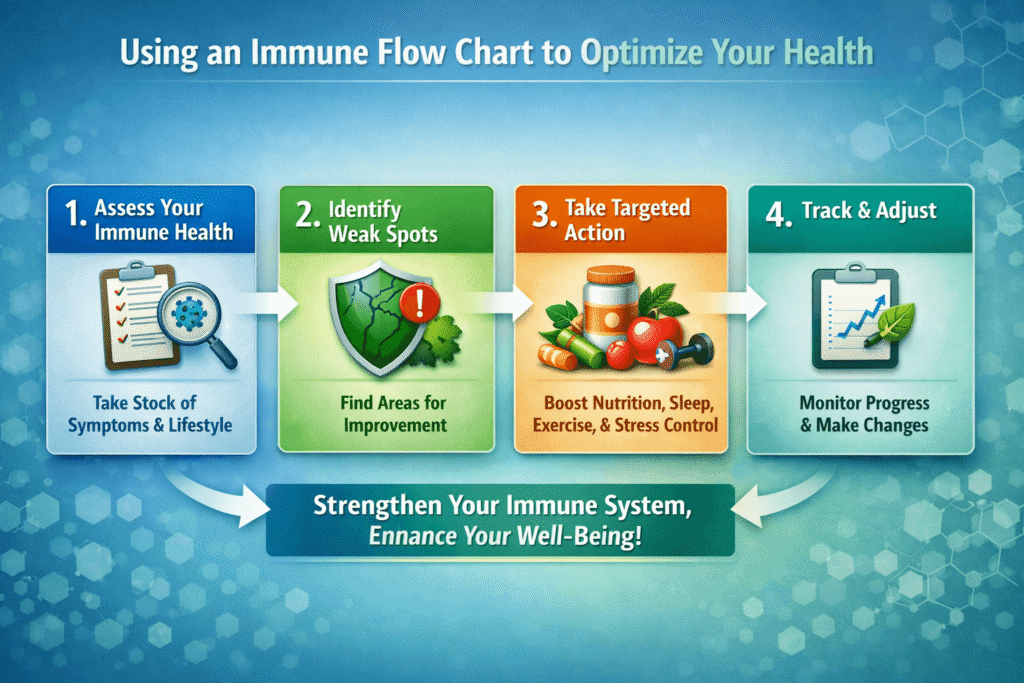
Step 1: Find a Quality Flow Chart
Not all immune system cells flow chart diagrams are created equal. Look for ones that:
- Show at least neutrophils, T cells, B cells, and macrophages
- Include cytokine signaling (the communication pathways)
- Use clear color coding and labeling
- Distinguish between innate (immediate) and adaptive (learned) immunity
Print it out or save it as a reference document.
Step 2: Map Your Own Weak Points
Using the immune system cells flow chart as a guide, identify where your immunity might be weak. Do you catch every cold? That suggests issues in your initial response phase (neutrophils and macrophages). Do you recover slowly? That might indicate weak T and B cell coordination.
Step 3: Target Support to That Phase
Once you know where your immune system needs help, nutrition and lifestyle changes become strategic rather than generic. Instead of taking random supplements, you’re supporting specific immune functions shown in your immune system cells flow chart.
Step 4: Monitor and Adjust
Track how often you get sick, how quickly you recover, and energy levels. These are real-world manifestations of how efficiently your immune cells are flowing through the pathways shown in an immune system cells flow chart.
FAQ Section: Common Questions About Immune System Cells Flow Charts
Q 1: What’s the Difference Between Innate and Adaptive Immunity on a Flow Chart?
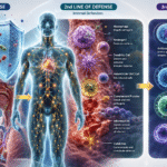
Innate immunity is your immediate response—it’s what happens within seconds to minutes when a pathogen is detected. It’s non-specific (your neutrophils and macrophages attack broadly). On an immune system cells flow chart, innate immunity usually appears on the left or top, as the first line of defense.
Adaptive immunity is learned and specific. It takes 3-5 days to activate but then becomes incredibly targeted. On your immune system cells flow chart, adaptive immunity appears later with T cells and B cells, which respond specifically to the exact pathogen your body has recognized. This is the sophisticated coordination that memory provides.
Q 2: How Do Vaccine Flow Charts Compare to Disease Flow Charts?
A vaccine essentially fast-forwards your immune system cells flow chart to the “memory formation” stage without requiring an actual infection. Instead of fighting a real disease (which is risky), your body practices its response using the vaccine’s trigger. This is why vaccinated people either don’t get sick or have much milder illness—their immune cells flow through the chart faster and more efficiently.
Q 3: Can I Change How My Immune Cells Function Based on an Immune System Cells Flow Chart?
Absolutely. While you can’t change the fundamental pathways (those are hardwired into your biology), you can optimize how efficiently cells flow through those pathways. Better nutrition means neutrophils respond faster. Adequate sleep means cytokines communicate effectively. Exercise improves antibody production. When you understand an immune system cells flow chart, you see exactly which lifestyle factors impact which immune functions.
Q 4: Why Do Some People’s Immune System Cells Flow Charts Seem More Efficient Than Others?
Genetics play a role—some people inherit more responsive immune systems. But lifestyle factors matter enormously. Chronic stress, poor sleep, inflammatory diets, and lack of exercise all bottleneck the flow in an immune system cells flow chart. Conversely, people who prioritize sleep, manage stress, eat well, and exercise have more efficient immune cell communication. It’s not about working harder; it’s about optimizing the system you already have.
Q 5: How Often Should I Review an Immune System Cells Flow Chart to Stay Informed?
You don’t need to obsess over it. However, if you’re dealing with recurrent infections, autoimmune issues, or recovering from illness, spending time studying an immune system cells flow chart helps you understand why certain interventions help. Review it whenever you make significant lifestyle changes or if your health shifts. Seasonal immune support often involves understanding which phase of the flow chart needs reinforcement in winter versus summer.
Q 6: Are There Apps That Show Interactive Immune System Cells Flow Charts?
Yes! Several educational apps and platforms provide interactive immune system cells flow chart visualizations where you can click on cells to learn about their function, trace pathways, and see what happens when you adjust variables (like removing a cell type or adding a stressor). These interactive versions often teach faster than static diagrams.
Q 7: How Does Stress Specifically Impact an Immune System Cells Flow Chart?
Stress hormones (cortisol) directly suppress T cell activation and reduce cytokine production. When you map this onto an immune system cells flow chart, you see the communication pathways literally getting muted. Helper T cells don’t receive signals as effectively. B cells don’t coordinate their antibody response as well. The flow stutters. This is why people under chronic stress catch more colds their immune flow chart isn’t functioning at full capacity.
Conclusion: Making Your Immune System Cells Flow Chart Work for You
An immune system cells flow chart isn’t just an interesting diagram to understand in a biology class. It’s actually a practical blueprint for health. When you grasp how immune cells communicate, coordinate, and collectively protect you, your health decisions shift from random to strategic.
The reality is this: your immune system is constantly flowing. Every second, your neutrophils are patrolling, your macrophages are cleaning, your T and B cells are learning. When you understand an immune system cells flow chart, you stop seeing immune health as something mysterious and start seeing it as something you can actively support.
The products and strategies we’ve discussed from elderberry supplements to sleep optimization to stress management all work because they optimize specific steps in your immune system’s flow chart. Knowledge truly is power here.
Start by finding a quality immune system cells flow chart and spending 15 minutes really understanding it. Then identify one weak point in your immunity and one action you can take this week to support it. That’s how understanding immune cell flow translates into real, measurable health improvements.
Your immune system is waiting to work at full capacity. Now you know exactly how it operates.